Wine culture has, historically, been a stuffy affair - the advertising aesthetics of which were centered around the mystery of barrel rooms and the elitism of a sophisticate market.
I love that things are changing.
“...free tattoos to clients...”
WineShop At Home, the client for this campaign, takes what seems to be a tech-industry, iterative design approach to branding their products. They have labels and brands covering a huge swath of potential markets and on the extreme edge is my personal favorite: Suburban Fracas.
The first image I created for this campaign was the laydown of bottles in a tattoo parlor (above). I created the parlor scene in my studio from my memories of previous tattoo experiences. It started with shaped lighting (emulating a narrow industrial window), a custom surface from Christian at Surfacehaus, and some art supplies I hunted down online.
It turns out that you can buy a tattoo gun kit online for about $50 (including ink!). Seems to me like there should be a greater cost barrier to owning that kind of equipment...but I'm now happy to offer free tattoos to clients that come by the studio.
“...an angsty 90s spirit in the sky...”
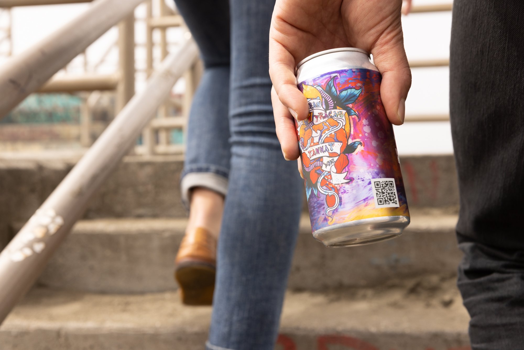
With label art created by a tattoo artist in Oakland, CA and a canned offering, this brand is playing well outside the mainstream of wine packaging.
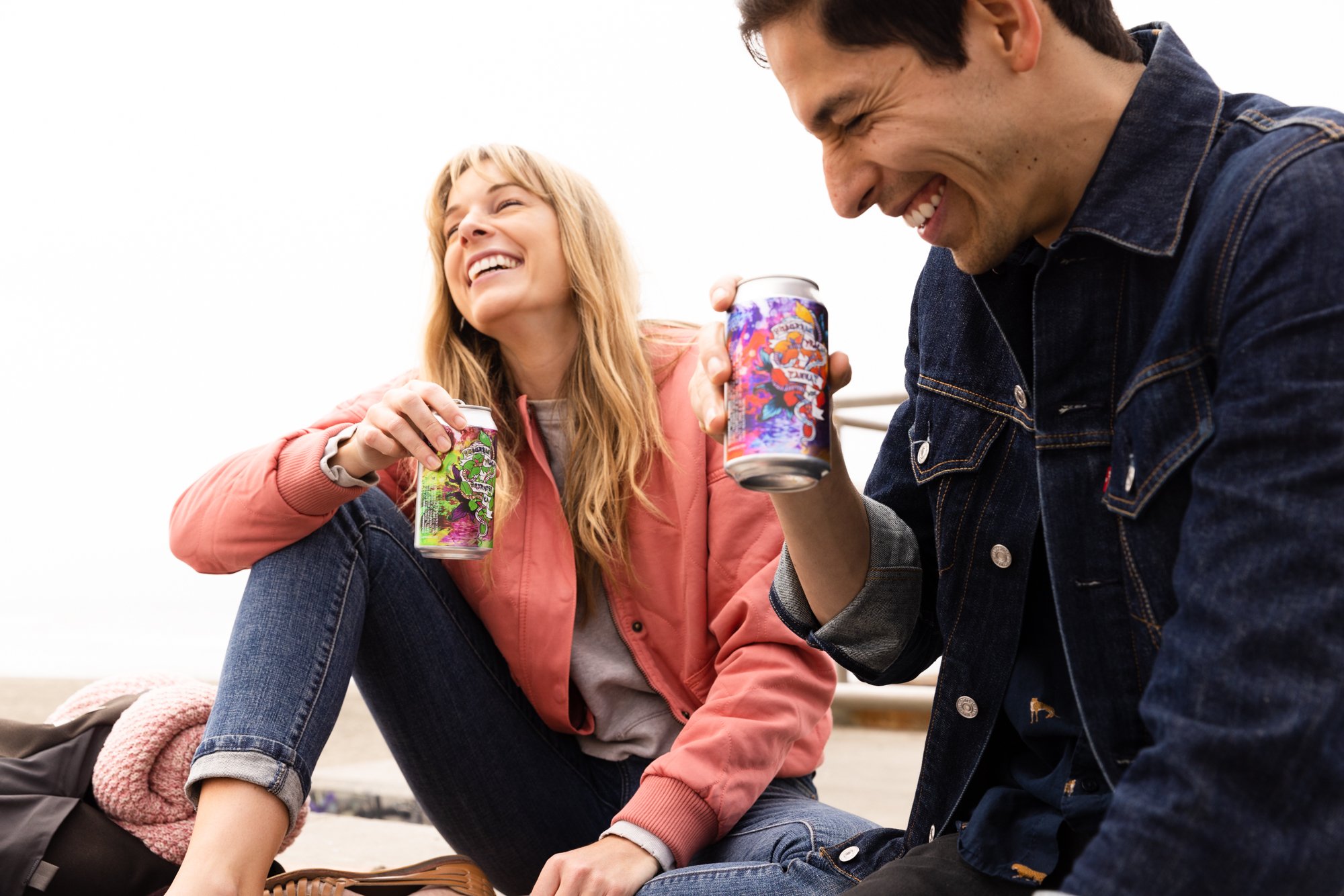
The photo campaign I was commissioned to produce had to carry an urban and playful mood. Initial inspiration was drawn from skate parks and a sort of 90's era rebellion.
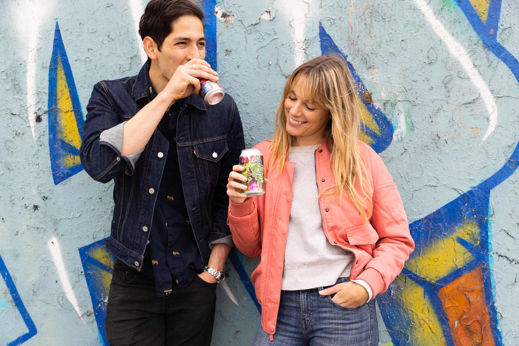
Casting was key both for demographics and attitude. The great folks at NYLO in San Francisco helped us put together a lively couple who embodied the mood and aesthetics of the creative direction.
Location was a trickier affair and after writing off nearly a dozen potentials, I remembered a shoot at San Francisco's Ocean Beach from years earlier with Faraday Bikes and Feral Wetsuits. It turned out to be the perfect mix of urban, graffiti, and coastal lifestyle dreamy. Not that the weather in San Francisco would ever cooperate of course...
Naturally, San Francisco dealt us a classic hand of heavy overcast and coastal wind. I came prepared with a lighting kit to cheer things up but ultimately decided to lean into the moodiness. It felt like there was an angsty 90's spirit in the sky and that was really on point with the direction.
With the bubbly energy of our pro talent, I steered the direction towards the "rebellious youth" angle. Peeling graffiti and hard angles of the old retaining walls gave us enough grit and texture to add depth - but the beach itself helped soften the landscape and make it feel fun and free, rather than claustrophobic and too urban.
Incredibly, the sun did eventually come out for us - and its timing couldn't have been better. The last two hours of our shoot had direct, low-angle light and a stunning sunset.
Luck...it's also part of art.
I'm grateful to have had the trust of WineShop At Home to conduct this shoot without the client present to art direct. For a playful, high-volume lifestyle concept like this it's often better to have fewer cooks in the kitchen anyway.
With a lot of pre-production to lay the foundation, my assistant and I were able to stay flexible and keep up with the shifting light, weather, and inspiration.
Developing the creative direction and photographing this campaign was one of the most fun wine industry projects I've had the pleasure to work on. There's nothing stuffy about this imagery or its narrative.


